Mastering Material Design 3: The Complete Guide to Theming in Flutter
 Christian Findlay
February 25, 2025
16 min read
Christian Findlay
February 25, 2025
16 min read
One of the most common questions developers ask when working with Flutter is how to manage themes to create consistent UI styles across their apps. Themes are part of the design system we use. Flutter apps usually use Material Design or Cupertino, but this article focuses on theming with Material Design 3 (M3) in Flutter. This article details how to create, customize, and apply themes in your Flutter applications.
Understanding Flutter Material Design Themes
M3 is Google’s latest design system for building apps and websites. Before looking into theming, you should read up about the design system. A theme in Flutter is a collection of property-value pairs that dictate the appearance of the app’s widgets. ThemeData is the class responsible for holding these properties. Let’s first understand the significance of ThemeData and how it helps in theming.
ThemeData
The ThemeData class encapsulates a Material Design theme’s colors, typography, and shape properties. We typically use it as an argument for the MaterialApp widget, which in turn applies the theme to all descendant widgets.
Creating a Custom Theme
Create a ThemeData instance and assign values to the properties you wish to customize. Let’s create a custom theme and apply it to our Flutter app. You can try this out in Dartpad. Just modify the existing default app there. M3 is now the default design system in Flutter so you don’t need to configure anything, but you can still explicitly set useMaterial3 to true if you want to make your intentions clear.
import 'package:flutter/material.dart';

ThemeData lightTheme = ThemeData(
  useMaterial3: true, // This is not necessary or recommended anymore.
  colorScheme: ColorScheme.fromSeed(
    seedColor: Colors.pink,
    brightness: Brightness.light,
  ),
  textTheme: const TextTheme(
    displayLarge: TextStyle(fontSize: 32, fontWeight: FontWeight.bold),
    bodyLarge: TextStyle(fontSize: 18),
  ),
);
The most important part of M3 theming is the ColorScheme. Instead of setting individual colors, you can use ColorScheme.fromSeed() to generate a complete, harmonious color scheme from a single seed color. This ensures your app follows M3 color guidelines and has good contrast ratios. It’s also the easiest way to get up and running without needing to harmonize the colors yourself.
Applying the ThemeData Instance
Pass the custom theme to the theme property of the MaterialApp widget.
void main() {
  runApp(
    MaterialApp(
      debugShowCheckedModeBanner: false,
      title: 'Custom Theme Demo',
      theme: lightTheme,
      home: Scaffold(
        body: Center(
          child: ElevatedButton(
            child: Text('Hello, Flutter!'),
            onPressed: () {},
          ),
        ),
      ),
    ),
  );
}
Using the Theme Properties
You can access the ThemeData properties with the Theme.of(context) method. Here’s an example of how to use the headlineMedium named style. You can read more about M3 Typography and scale here.
Text(
  'Hello, Flutter!',
  style: Theme.of(context).textTheme.headlineMedium,
);
Dark and Light Themes
Flutter allows you to define separate themes for dark and light modes. You can set the darkTheme property of the MaterialApp widget. You can use the same seed color for both light and dark themes to maintain color consistency. That means you only need to change the brightness.
ThemeData darkTheme = ThemeData(
  useMaterial3: true,
  colorScheme: ColorScheme.fromSeed(
    seedColor: Colors.pink,  // Same as light theme
    brightness: Brightness.dark,
  ),
  // These modify the default text styles.
  textTheme: const TextTheme(
    displayLarge: TextStyle(fontSize: 32, fontWeight: FontWeight.bold),
    bodyLarge: TextStyle(fontSize: 18),
  ),
);
The ColorScheme.fromSeed constructor automatically adjusts all colors to be appropriate for dark or light mode, and you’ll have the same color harmony in light or dark mode. This ensures a consistent brand identity across both themes.
Applying Dark ThemeData Instance
This example tells Flutter that there are two themes: light and dark. Flutter automatically switches between the two themes based on the device’s brightness settings.
void main() {
  runApp(
    MaterialApp(
      debugShowCheckedModeBanner: false,
      title: 'Custom Theme Demo',
      darkTheme: darkTheme,
      theme: lightTheme,
      home: Scaffold(
        body: Center(
          child: ElevatedButton(
            child: Text(
              'Hello, Flutter!',
            ),
            onPressed: () {},
          ),
        ),
      ),
    ),
  );
}
You can also manually set the theme mode to light or dark using the themeMode property of the MaterialApp widget. If you do this, the Flutter app will ignore your device’s brightness setting and use the theme you specify, which is light in this case.
void main() {
  runApp(
    MaterialApp(
      themeMode: ThemeMode.light,
      debugShowCheckedModeBanner: false,
      title: 'Custom Theme Demo',
      darkTheme: darkTheme,
      theme: lightTheme,
      home: Scaffold(
        body: Center(
          child: ElevatedButton(
            child: Text(
              'Hello, Flutter!',
            ),
            onPressed: () {},
          ),
        ),
      ),
    ),
  );
}
The Importance of ColorScheme in Material Design 3
Flutter widgets pay particular attention to the ColorScheme class in your theme data. ColorScheme is the foundation of M3’s color system and determines how your app’s colors work together.
What is ColorScheme?
ColorScheme defines the complete set of colors used by M3. Using ColorSchemes ensure proper contrast ratios and accessibility. Here are the key color roles included in the class:
- Primary colors: Used for key components and actions
- Secondary colors: Used for less prominent components
- Tertiary colors: Used for contrasting accents
- Error colors: Used for error states
- Surface colors:
Try our new Seed Color Picker, which allows you to see how the seed color affects common widgets in your app.
load hfref in new tab
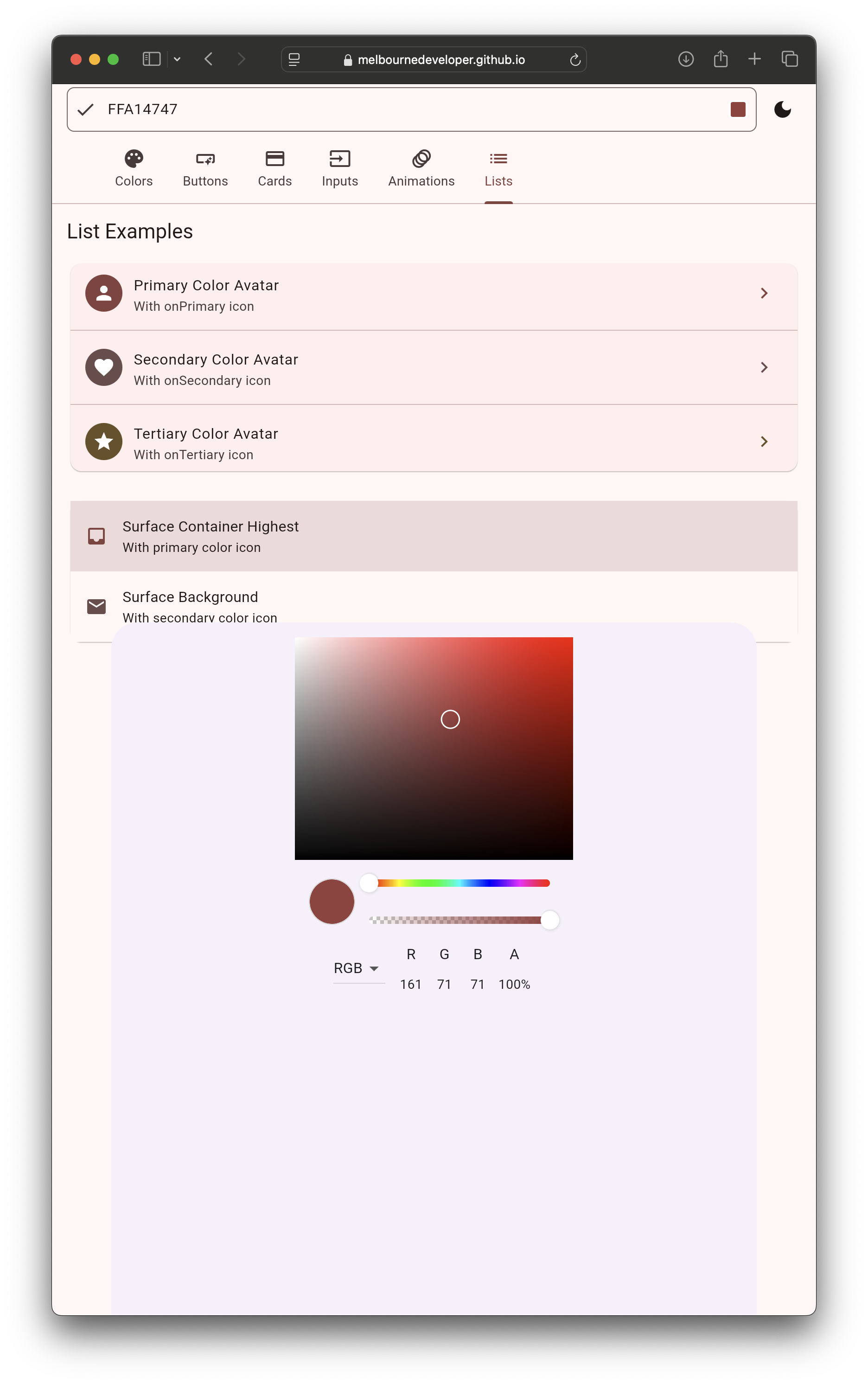
Default colors in Material Design 3
The primary purpose of a ColorScheme is to provide a cohesive set of colors that work together. Components automatically use the appropriate colors from your ColorScheme in M3. This makes it easier to create a consistent color palette while adhering to Material Design guidelines.
You can create a ThemeData with a custom secondary color in the ColorScheme like the code below. However, you should exercise caution because it can break the color harmony of the app. If you do specify a secondary color, you will need to work out if it harmonizes with the other default colors.
ThemeData(
  useMaterial3: true,
  colorScheme: ColorScheme.fromSeed(
    seedColor: Colors.blue,
    secondary: Colors.teal,  // Overrides the secondary color
    brightness: Brightness.light,
  ),
)
While you can override specific colors in the ColorScheme, you’re best of sticking to ColorScheme.fromSeed() without overrides. This ensures all colors work together harmoniously and meet accessibility guidelines.
Identifying How Widgets Get Their Default Color
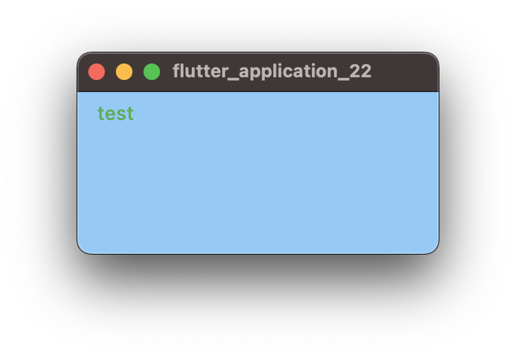
Widgets get their default color from the ColorScheme. Each widget has a set of specific properties that define the various colors it uses. For example, TextButton gets the foreground text color from ColorScheme.primary. In this example, the button’s text displays as green. This example demonstrates how changing the primary color changes the button’s color.
import 'package:flutter/material.dart';

void main() => runApp(
      MaterialApp(
        theme: ThemeData(
          brightness: Brightness.light,
          colorScheme: ColorScheme.fromSeed(
            seedColor: Colors.blue,
          ).copyWith(
            primary: Colors.green,
          ),
        ),
        debugShowCheckedModeBanner: false,
        home: Scaffold(
          body: TextButton(
            onPressed: () {},
            child: const Text('test'),
          ),
        ),
      ),
    );
Unfortunately, there is no one-size-fits-all way to determine which property of the ColorScheme the widget uses because they use different color properties for their default color. The primary sources for learning these are a) the Flutter source code and b) the documentation.
You won’t always find the answer in the documentation, so look at the widget’s source code. Flutter is open-source. You can view the source code for any widget to see exactly how it works. Simply ctrl+click (or cmd+click on macOS) on the widget name in your editor if you are using an IDE like VSCode or Android Studio. This should take you to the definition in the source code.
For example, buttons have a defaultStyleOf method that returns a ButtonStyle. This code is from the Flutter source code for _TextButtonDefaultsM3, which shows you how the TextButton widget picks up the foreground color from the ColorScheme.primary property. Notice how the code applies difference opacity values to the colors depending on the state of the button. Also notice how the background color for TextButton is set to transparent, instead of a M3 color.
class _TextButtonDefaultsM3 extends ButtonStyle {
  _TextButtonDefaultsM3(this.context)
   : super(
       animationDuration: kThemeChangeDuration,
       enableFeedback: true,
       alignment: Alignment.center,
     );

  final BuildContext context;
  late final ColorScheme _colors = Theme.of(context).colorScheme;

  @override
  MaterialStateProperty<TextStyle?> get textStyle =>
    MaterialStatePropertyAll<TextStyle?>(Theme.of(context).textTheme.labelLarge);

  @override
  MaterialStateProperty<Color?>? get backgroundColor =>
    const MaterialStatePropertyAll<Color>(Colors.transparent);

  @override
  MaterialStateProperty<Color?>? get foregroundColor =>
    MaterialStateProperty.resolveWith((Set<MaterialState> states) {
      if (states.contains(MaterialState.disabled)) {
        return _colors.onSurface.withOpacity(0.38);
      }
      return _colors.primary;
    });

  @override
  MaterialStateProperty<Color?>? get overlayColor =>
    MaterialStateProperty.resolveWith((Set<MaterialState> states) {
      if (states.contains(MaterialState.pressed)) {
        return _colors.primary.withOpacity(0.1);
      }
      if (states.contains(MaterialState.hovered)) {
        return _colors.primary.withOpacity(0.08);
      }
      if (states.contains(MaterialState.focused)) {
        return _colors.primary.withOpacity(0.1);
      }
      return null;
    });

  @override
  MaterialStateProperty<Color>? get shadowColor =>
    const MaterialStatePropertyAll<Color>(Colors.transparent);

  @override
  MaterialStateProperty<Color>? get surfaceTintColor =>
    const MaterialStatePropertyAll<Color>(Colors.transparent);

  @override
  MaterialStateProperty<double>? get elevation =>
    const MaterialStatePropertyAll<double>(0.0);

  @override
  MaterialStateProperty<EdgeInsetsGeometry>? get padding =>
    MaterialStatePropertyAll<EdgeInsetsGeometry>(_scaledPadding(context));

  @override
  MaterialStateProperty<Size>? get minimumSize =>
    const MaterialStatePropertyAll<Size>(Size(64.0, 40.0));

  // No default fixedSize

  @override
  MaterialStateProperty<double>? get iconSize =>
    const MaterialStatePropertyAll<double>(18.0);

  @override
  MaterialStateProperty<Color>? get iconColor {
    return MaterialStateProperty.resolveWith((Set<MaterialState> states) {
      if (states.contains(MaterialState.disabled)) {
        return _colors.onSurface.withOpacity(0.38);
      }
      if (states.contains(MaterialState.pressed)) {
        return _colors.primary;
      }
      if (states.contains(MaterialState.hovered)) {
        return _colors.primary;
      }
      if (states.contains(MaterialState.focused)) {
        return _colors.primary;
      }
      return _colors.primary;
    });
  }

  @override
  MaterialStateProperty<Size>? get maximumSize =>
    const MaterialStatePropertyAll<Size>(Size.infinite);

  // No default side

  @override
  MaterialStateProperty<OutlinedBorder>? get shape =>
    const MaterialStatePropertyAll<OutlinedBorder>(StadiumBorder());

  @override
  MaterialStateProperty<MouseCursor?>? get mouseCursor =>
    MaterialStateProperty.resolveWith((Set<MaterialState> states) {
      if (states.contains(MaterialState.disabled)) {
        return SystemMouseCursors.basic;
      }
      return SystemMouseCursors.click;
    });

  @override
  VisualDensity? get visualDensity => Theme.of(context).visualDensity;

  @override
  MaterialTapTargetSize? get tapTargetSize => Theme.of(context).materialTapTargetSize;

  @override
  InteractiveInkFeatureFactory? get splashFactory => Theme.of(context).splashFactory;
}
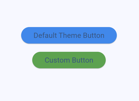
Override Default Colors For Widgets
You can override colors for a specific widget at the theme level. This can be a shortcut to finding the ColorScheme default color, but it means you only change the color for a given widget. Widgets that should have the same colors according to M3 may end up with different colors. If you need to override colors, there are three levels where you can do this:
ColorScheme Level
Modify the entire color scheme by adjusting the seed color or overriding specific scheme colors.
Widget Theme Level
Customize colors for all instances of a particular widget type using component themes.
Individual Widget Level
Override colors for specific widget instances.
Tips:
- Always start with
ColorScheme.fromSeed()for your base colors - Try to use the default color assignments before overriding
- When overriding, prefer higher-level overrides (ColorScheme > Component Theme > Individual Widget)
- Consider accessibility and contrast when overriding colors
- Use
WidgetStateProperty(formerlyMaterialStateProperty) for state-dependent colors
import 'package:flutter/material.dart';

void main() => runApp(
      MaterialApp(
        debugShowCheckedModeBanner: false,
        theme: ThemeData(
          // 1. ColorScheme Level: Adjust the entire color scheme
          colorScheme: ColorScheme.fromSeed(
            seedColor: Colors.blue,
            // Override specific scheme colors if needed (not recommended)
            secondary: Colors.teal,
          ),
          // 2. Component Theme Level: Customize all ElevatedButtons
          elevatedButtonTheme: ElevatedButtonThemeData(
            style: ButtonStyle(
              backgroundColor: WidgetStateProperty.resolveWith<Color?>(
                (Set<WidgetState> states) {
                  if (states.contains(WidgetState.disabled)) {
                    return Colors.grey.withValues(alpha: 0.5);
                  }
                  return Colors.blue;
                },
              ),
            ),
          ),
        ),
        home: Scaffold(
          body: Center(
            child: Column(
              mainAxisAlignment: MainAxisAlignment.center,
              children: [
                // Uses the component theme
                ElevatedButton(
                  onPressed: () {},
                  child: const Text('Default Theme Button'),
                ),
                const SizedBox(height: 16),
                // 3. Individual Widget Level: Override for this instance
                ElevatedButton(
                  onPressed: () {},
                  style: ElevatedButton.styleFrom(
                    backgroundColor: Colors.green,
                  ),
                  child: const Text('Custom Button'),
                ),
              ],
            ),
          ),
        ),
      ),
    );
Complete Example
This example allows you to toggle between the three theme modes to see how the dark and light themes look. You can modify the code to check out how the different colors apply to the widgets.
Staying Up To Date
Flutter’s implementation of M3 is always evolving. Some Flutter releases involve breaking changes to how colors and theming for M3 work. You can stay up to date with the latest changes on the offical Flutter documentation website.
Introduce new ColorScheme roles for Material 3
Breaking changes and migration guides
Modifying Typography with TextStyles
Typography is an important aspect of Material Design, and Flutter’s ThemeData allows you to customize the typography of your app. This includes adjusting font sizes, weights, and colors for different text styles. The textTheme property of ThemeData contains a TextTheme object, which in turn has a set of predefined TextStyle properties. These properties represent different text styles like headlines, body text, captions, etc. You can modify the TextStyle properties to customize the typography for each style. This is an example of setting the font sizes and weights.
ThemeData lightTheme = ThemeData(
  textTheme: const TextTheme(
    displayLarge: TextStyle(
        fontSize: 96, fontWeight: FontWeight.w300, color: Colors.black),
    displayMedium: TextStyle(
        fontSize: 60, fontWeight: FontWeight.w400, color: Colors.black),
    displaySmall: TextStyle(
        fontSize: 48, fontWeight: FontWeight.w400, color: Colors.black),
    headlineMedium: TextStyle(
        fontSize: 34, fontWeight: FontWeight.w400, color: Colors.black),
    headlineSmall: TextStyle(
        fontSize: 24, fontWeight: FontWeight.w400, color: Colors.black),
    titleLarge: TextStyle(
        fontSize: 20, fontWeight: FontWeight.w500, color: Colors.black),
    bodyLarge: TextStyle(
        fontSize: 16, fontWeight: FontWeight.w400, color: Colors.black87),
    bodyMedium: TextStyle(
        fontSize: 14, fontWeight: FontWeight.w400, color: Colors.black87),
    bodySmall: TextStyle(
        fontSize: 12, fontWeight: FontWeight.w400, color: Colors.black54),
    labelLarge: TextStyle(
        fontSize: 14, fontWeight: FontWeight.w500, color: Colors.white),
  ),
);
You can use these styles in your app with the Theme.of(context).textTheme property, and the Text widget’s default TextStyle is bodyMedium. This example shows how to set the text style, how the Text widget picks up the default style, and how to use a named TextStyle from the theme.
Theme Shapes
Defining shapes at the theme level in Flutter ensures your design remains consistent, making your application more intuitive and appealing to users. Shapes in M3 can be simple or complex, adding depth and enhancing the visual hierarchy of the user interface. From subtle round edges to bold, expressive cut corners, shape variations can significantly impact a design’s feel and functionality.
To define shapes at the theme level, specify the shape parameter of the widget’s theme like this.
ThemeData(
  useMaterial3: true,
  cardTheme: CardTheme(
    shape: RoundedRectangleBorder(
      borderRadius: BorderRadius.circular(4.0),
    ),
  ),
)
The theme sets the default shape for the widget, and you can reference the shape from Theme.
Card(
  shape: Theme.of(context).cardTheme.shape,
  child: const SizedBox(
    width: 100,
    height: 100,
  ),
),
This is a complete example. The first card uses the default shape, and the second uses a custom shape.
Conclusion
Grasping Flutter’s M3 themes is key for modern application design, so spend some time on the Material Design website to learn more about the system and how to use it in your apps. Refer back to this guide when you need an overview but remember to take the time to read the official documentation. Also, experiment with themes in Dartpad. This will save you a lot of time. Lastly, remember than you may need to check the actual Flutter code of the widgets to find out where they are getting their default theme values from.
Updated Feburary 2025. Previous versions, such as 2024/01/04 are available on GitHub as markdown.